190+ Developer Products, 800+ Documents, 23 scattered sites - All came together to become a unified portal for 17,000 + Developers.
Take a deeper look at how we built this for a retail giant and enhanced their Developer Experience.
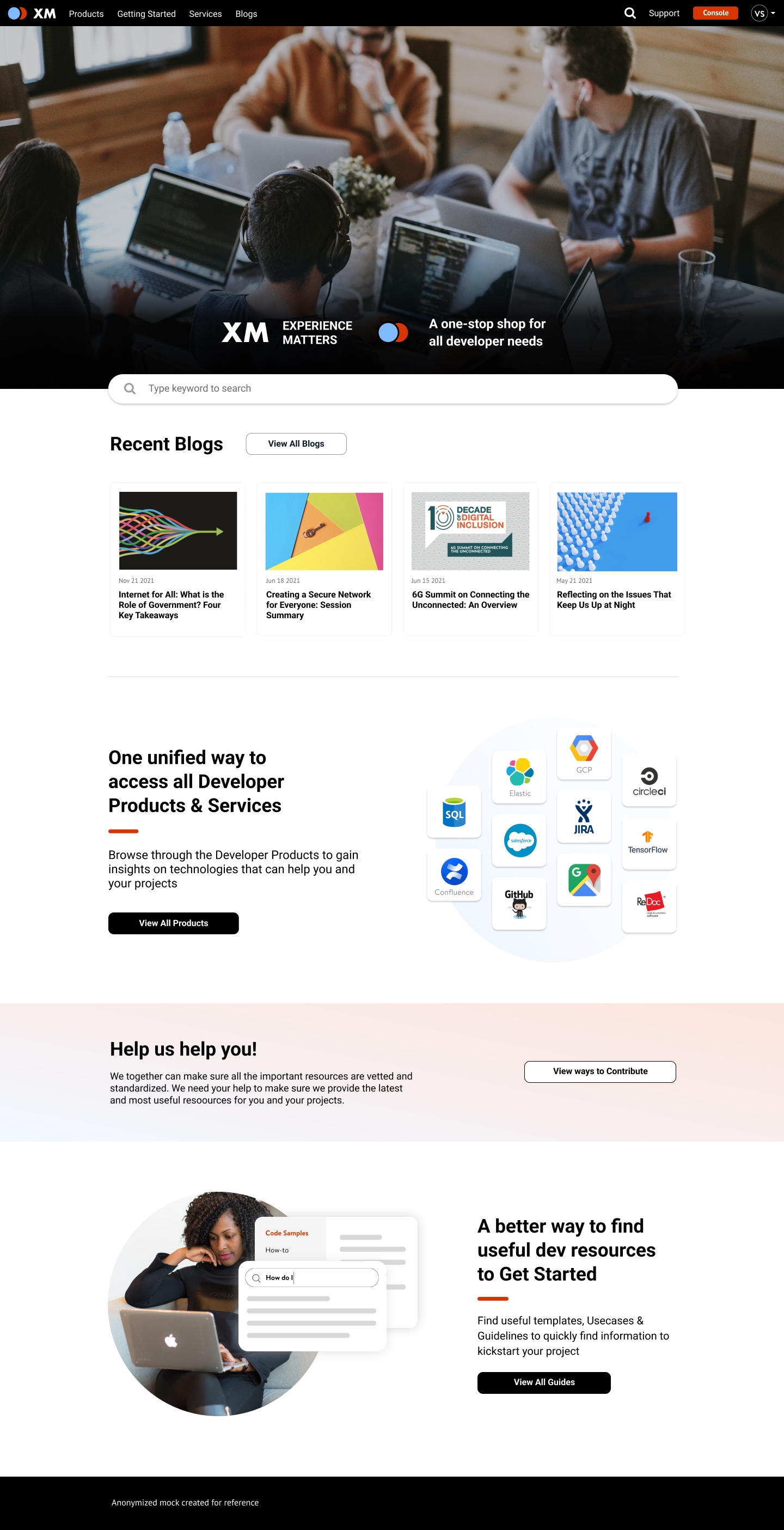
If you are someone who has worked with developers in some capacity, you might have come across phrases like
"It's deployed, waiting for the build to finish"
"Dev setup alone takes up the entire sprint"
"No more changes after this push to prod"
"Not sure why but the build has failed"
These are some of the things I have come across in my professional life designing apps. To be honest I used to judge each and every phrase thinking how hard is it to do this - until I worked on this project and learned about the loops developers have to go through to deploy simple changes.
It's only recently that companies have thought about the developer experience addressing challenges like standard documentation, universal templates, patterns and guidelines, App Starter Kits etc.
The client in this project is one of those who are actively changing their approach towards Developer Experience and hoping to provide a better platform to address these challenges.
My Role
Lead
Lead a 2 member design team to evaluate, identify and create interactive mocks that capture the project vision and end user goals.
Plan & Facilitate
Validate mocks with users, stakeholders and the development team and assist Product managers in roadmap planning.
Implement
Ensure flawless implementation of the design through continuos collaboration with the development team. Strategize Component libraries for reusability.
To simply put I was responsible for understanding the problems and come up with a solution along with Product Managers, Engineering leads and execs.
I lead a team of 2 amazing designers who gracefully indulged in several of my ad-hoc brainstorm sessions, iterations - culminating into a full blown portal that was received extremely well and even resulted in promotions for key contributors!
STEP 1
Discovery
Going into the project we were not sure where to start since the information conveyed was not enough. We required more to start assessing and planning our way through and formulate the business goals, user goals etc. Basically we needed data to begin. For this, we started with interviewing the key players - Stakeholders, Users & Department Leads.
Stakeholder Interviews
We met with the stakeholders to understand exactly how they perceive the problem, get insights on what would be the right approach and who would can give us more info.
"We need to unify all the scattered sites and provide one platform. That needs to be the source of truth. All department leads need to get on the same page."
"The engineers who are just joining, take a lot of time to ramp up because of so many different sources of information. We have an opportunity to reduce the onboarding time."
Department Leads
Department Leads were the key in understanding the magnitude of the project since the vision was to have one unified platform. Talking to the leads helped us uncover their scattered workflow, support tickets & document management
"My team spends a lot of time answering the same questions about which document is the standard?, is there a new version of the patterns? can I use this product in my project? "
"There is a huge disconnect between the tools and processes throughout our development lifecycle. We need to integrate and automate as much as possible"
Users
Our users are mostly developers with varying experience within the organization. With the help of the leads we selected developers from different departments, even including some of the new joiners going through onboarding. In total we interviewed about 9 developers to get a good handle on our users mental model.
"By the time I find a guideline document and start implementing those steps, someone sends me a new version. Even the collaborators usually are not aware of those new updates"
"It would be good to have one place that is standardized so that I don't have to do more work to find something. I just want to go there and start consuming the information"
"I have a list of steps noted down for deployment. It usually takes a while to finish all the additional steps apart from finishing the coding. It becomes difficult to explain why deployment is taking time"
STEP 2
User Personas
After getting all the possible information, we started to analyze and identify the themes in our data. We worked alongside the Product Manager to make sure we don't digress too much. Our initial analysis resulted in a set of themes which we later distilled to finalize three major types of users and defined their needs and pain points.
Consumer
Developer who is looking to consume resources for learning and software development tooling
Challenges
Content Discovery & Learning: No single source of truth for developer resources
Application Setup & Approvals: Too many scattered portals with separate onboarding process
Deployment Management & Performance: Lack of integration and automation between tools & processes throughout the development lifecycle
Contributor
Developer or Product Manager who would like to share content, resources and experiences.
Challenges
Tool Integration Process: Difficult deeper-level integrations into central platform due to varying design patterns, UX flows, and technology stacks used for existing tool-sets
Standardized Process & Tooling: Uncertainty of where to contribute as a result of lacking guidelines, process, and tooling for contributing product documentation, APIs, Starter Kit templates, code samples, and insights.
Moderator
Developer or department lead who is responsible for the standardization of the recommended guidelines, templates, architectural designs, training and onboarding documents.
Challenges
Unscalable Review Processes: Existing process requires manual steps and human reviews/approvals.
Content Quality: Difficult to enforce guidelines, starter kits and other docs quality checks/gates
Communication Channels: Uncertainty about support process due to plethora of communication channels.
Step 3
Journey Map
After deciding the key user personas we started to explore the current user journey through the organization. We identified the activities, touchpoints and departments related to the stages of development lifecycle. Doing this, allowed us to figure out opportunities to improve and also gave us an overview of several integrations that need to happen within the several scattered sites across the organization.
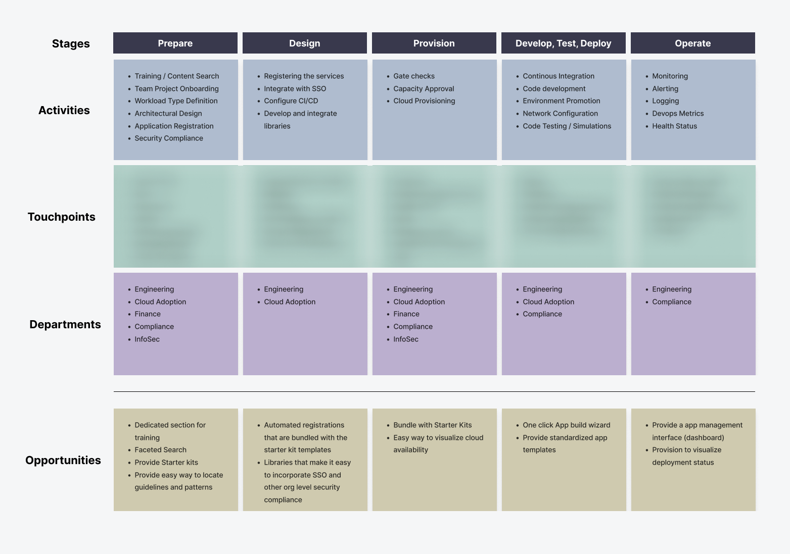
Note: Touchpoints blurred on purpose
Step 4
The Big Picture
Now that we got a good view of the landscape and where we were heading, we wanted to summarize our approach in a few sentences. We came up with a high level, short descriptions for the Business Goals + User goals and sought to get sign-off from the key stakeholders. We also decided together as a team on a few target goals that would set us on the right path and also help us measure our success.
Business Goals
Build a unified portal that serves all developers with the resources and functionalities that enables them to accelerate, optimize, and ship quality code.
User Goals
Access a unified portal that simplifies finding useful resources like recommended products, patterns, templates, guidelines etc. Reduce app building time by utilizing available Starter kits and App templates that are fully automated, integrated and tested to work seamlessly with the required compliances, checks and monitoring.
Target Goals
- 10K Monthly Active Users
- 1 week of onboarding time
- One source of truth for all products, guides & patterns
- Less than 5 mins App build time
Step 5
Brainstorming & User flows
After getting an official sign-off on our approach and goals we started brainstorming on the user flows and dependencies that needs to be taken into account. We actively shared the flow with the department leads to get timely feedback. The challenge here was to get everyone on the same page. With some adjustments to the flow and the timeline we were able to freeze on 1 unified user flow
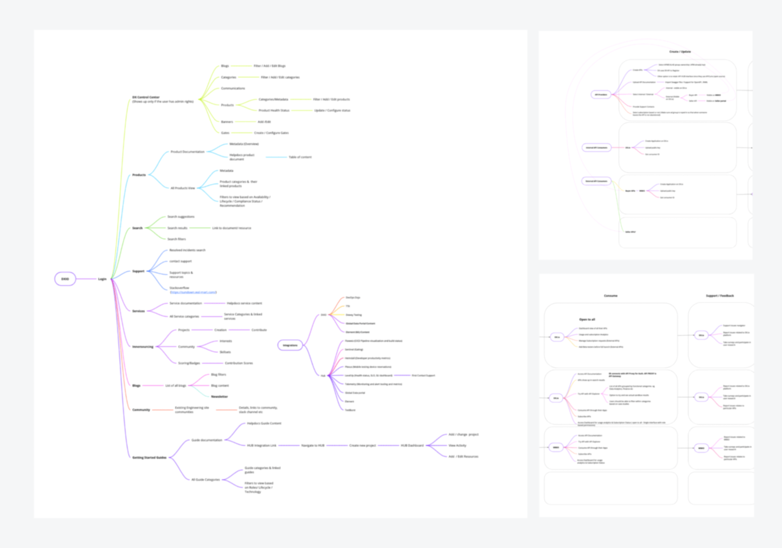
Note: Blurred on purpose
Step 6
Content Assessment
One of the biggest challenge we faced was to handle the huge data that was part of the content expected to be comsumed by the users. Since design will drastically be impacted by the available data and also the future data, we sought to get an estimation on some of the important areas that will be heavy in data. Several ocassions we had to visualize the hierarchy to get a better understanding of the data so that we could come up with a re-usable structure
The MVP that we decided on was targeted to include just the desktop users in the first phase. We compared and analyzed the data estimations with respect to the web experience. Our efforts involved speaking to Engineering Leads, Front-end experts to provide an overall idea of the page loading time without compromising the User Experience
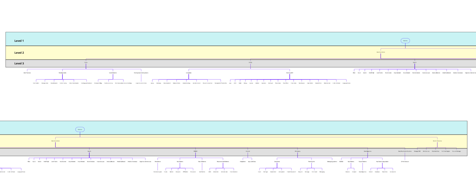
Visual representation of the levels of data that needed to be comsumed by the user. Different colors represent the different hierarchy levels. Ths approach helped us structure and also set limitations on the magnitude of the data to be showcased in one go.
Step 7
Learning through Iterations
Iterations uploaded to invision projects
After deciding the features, content and MVP goals we went ahead with medium-fidelity interactive mocks with clearly defined scenarios. This was an iterative process. I mean really iterative process.
Everytime we did testing we got to know about some other important aspect, feature or area that was left out. The quick testing allowed us to reach out to different departments and the mocks definitely came in handy to set the context and learn more.
After atleast 6 different versions we finally arrived at the one that was signed-off by everyone we tested, along with excitement to see the finished product
Showcasing
Mocks and Interactions
Product Catalog
One of the feature that everyone requested was the ability to browse through products that are available inside the org with recommendations and compliance tags. We built a robust product catalog that houses around 200 products categorized into familiar buckets.
Users can click on the product to view additional info like - Links to docs, P1 support, cloud availability etc without leaving the page with the help of collapsible side panels. The filter menu above the product listings allows users to filter based on several parameters.

Search Experience
One thing that is extremely important for a unified portal to enable easy discovery is a robust search feature. We made sure search can be performed from any screen of the entire app. The results are based on ratings derived from custom algorithm.
The filters on the left helps developers further narrow down on the desired results. To ensure transparency on the freshness of the content, we decided to provide the updated date to keep a check on stale data.
To enahnce the overall discoverability we made sure to include important categories such as products, APIs and Starter Kits as an option in the main search experience. Whenever the result include these they popup at the top.
Another important feature we wanted to provide was the Stackoverflow Q&A. Along with other things Q&A helps developers easily get to issues that have been already resolved, thus saving a lot of time & effort.

My portolfio is a work in progress. I will continue updating whenever I find some time.
Meanwhile, please reach out to me if you are interested to know more. I would be happy to walk you through more details!
Skills
- A/B Tests
- Design Systems
- Interactive Prototyping
- Roadmap Planning
- Usability Tests
- User Flows
- User Journey Maps
- User Research
- Visual Design
- Wireframes
Tools
- Adobe Illustrator
- Adobe Photoshop
- Adobe XD
- Axure RP
- Figma
- Fusion 360
- Invision
- Sketch
Technologies
- Android SDK
- CSS
- HTML
- Java
- Javascript
- React
